
overview
IFGF Conference is an annual conference that has been held since 1998, by a non-profit organization called IFGF. This conference is an opportunity for IFGF members globally to learn further regarding their personal growth. It covers topics such as leadership, religious beliefs, marketplace and businesses, current trends, etc.
project goal
HMW create a more convenient and appealing platform for users to maximize their conference experience?
role
UI/UX Designer
duration
4 weeks
team
Project Manager
Web Developers

01
EMPATHIZE WITH THE USERS
research
After conducting stakeholder interviews, I began this project by conducting desk research on IFGF, the organization itself, and the competitors to better understand how organizations conduct online conferences, current trends, and user expectations and preferences. Here is a summary of the insights I discovered:
About the conference:
2 days conference with multiple sessions and multiple Zoom workshops that attendees are able to choose from.
Users overview based on previous conferences trends:
# of attendees: 1000-1500
average age: 42 years old (age range: 24-60 years old)
psychographics: mostly not tech-savvy
Initial issues stated by the Project Manager:
-
A high number of inquiries from users regarding login credentials
-
Attendees' numbers dropped and/or varies in each session, unlike onsite conferences
Pre-existing features in the virtual conference:
-
Workshop Sessions through Zoom webinars
-
Multiple attendees lounge categorized by region through Zoom room & breakouts
learning from existing experience
1:1 user interviews with pre-existing users who have utilized this platform for the previous year's conference, and new users who have never seen the dashboard.
Demographics:
-
24-28 age group, 50-55 age group
-
2/3 participants have attended the previous year's conference
-
1/3 participants have not seen the dashboard but will be attending the 2021 Conference
Interview Insights:
-
The dashboard is hard to navigate, unclear instructions on what to do and where to go especially during the Workshop Session
-
The ad banners are distracting and mix-match colored with the whole theme
-
Users are not sure who is currently speaking and what is currently happening in terms of the session and rundown
-
Very messy layout, there are similar items of different sizes
On top of the user interviews, I did a usability audit and also a heuristic evaluation to further list down the major points and issues that need to be addressed in the new design.
The major issues identified are as follows:
-
The design is too overcrowded and cluttered, no hierarchy
-
Broken links and no clear distinction between clickable items and unclickable items in the dashboard
-
Colors are highlighting the wrong emphasis on buttons, also in terms of readability and color contrast
-
Consistency of standards: design system inconsistencies
-
No clear guide for users on what to expect next
-
No indication on what page users are in
-
Information on speakers, schedules, and contents are in multiple different buttons or dropdowns that made it hard to track
02
DEFINE THE PROBLEM
issues faced by user
Based on previous dashboard,
-
Users are confused on where to go, and how to navigate the dashboard
-
Users have a hard time navigating the process of the dashboard, especially when they accidentally clicked the wrong button
-
Users are not aware of the whole flow and details of the event
-
Designs are not appealing to customer-facing users
.png)
user persona
Based on the insights from my research, I created two user personas.
Their motivations, needs, and frustrations influenced the major decision in the product design and development process.


03
IDEATE SOLUTIONS
proposed solutions
01 An interactive side navigation bar
Creating a default, hovered, and clicked state in the navigation bar will assist and notify users on which page where they are at.
-
It will have micro animation when hovered and highlighted when clicked. The orange color is the highlight that indicates which page is clicked.
-
It will also make it appealing to the users to use this feature since it's not going to be a monotone and static feature.
Creating a side navigation bar
-
Can also be helpful since users tend to read in an "F" pattern, from left to right, so the left navigation bar would be what they see first, remembering the demographics of the users might vary from tech-savvy to older generations who are not familiar with the technology


02 Interactive Schedule Info
Instead of categorizing the information based on each title (workshop day 1, speakers day 1, schedule day 1, workshop day 2, etc.), minimize the confusion of the users by categorizing per conference day (day 1 and day 2 tabs), with all the information they need to find.
Expand and collapse feature in the schedule information will enhance the user experience by letting users have the control and freedom to choose what they want to see and read further for the schedule.
03 Color and shape-based clickable items
Having to navigate an unfamiliar platform is hard enough already, giving users the ease and ability to recognize which items are clickable and which items are not clickable would be

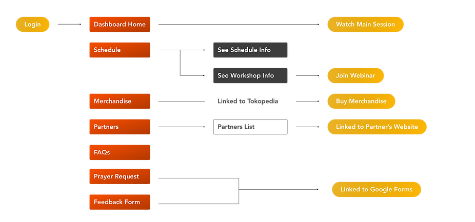
user flow
hi-fi design


other IFGF projects


IFGF Global Conference 2021
Promo Website & User Dashboard
IFGF Global Conference 2022
Promo Website & User Dashboard


